11/02/2019
New corporate image of C3 Systems
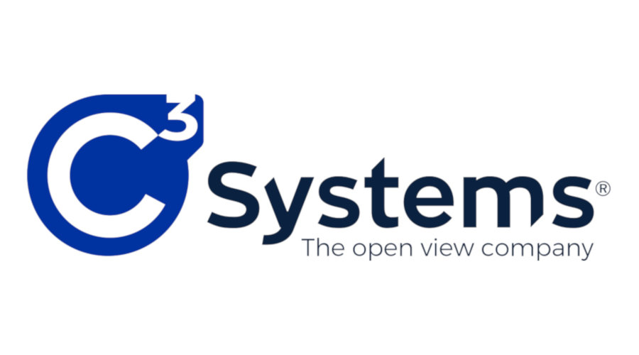
We would like to communicate that C3 SystemS logo and Seeglass, Seesky and Habitat product ranges logos have been modified, resulting in a new company image.
With this change, C3 SystemS shows the remarkable jorney the enterprise has experienced over the last ten years. These new identities act as a reflection of the team's growth, culminating in an edgy and technical image.
In addtion, this pivotal design shift not only serves as the new flagship, but also responds to the need for union and integration that the firm wants to achieve.


In this way, each product will stop having its own color and typography and now they will share a cohesive line with the rest of the models in its range. Thus, all the products of the Seeglass family will have the same blue tone and typeface, which provides uniformity and consistency. The same happens with the Seesky and Habitat ranges, represented by the green and magenta tones respectively.
Variations implemented in the C3 SystemS logo follow this approach, with a series of noticeable aspects:

- The Pro Zone typeface portrays a modern and striking appearance. The cuts in some of the letters are in tune with the brand's slogan: "the open view company".
- The color filling that includes the "C" and the "3" adapts to the silhouette of these figures, moving to a more straight and aesthetic shape.
By incorporating these changes, C3 SystemS showcases its trajectory and conveys that teamwork and unity are essential to achieve excellence.


